

The Challenge
Perform Website Usability Audit for a Marketing Agency Client
Inspira, an experiential marketing agency, has been a long-time website client of Amsive’s. We designed and developed their initial website, which has stood the test of time for years. As web trends evolve and agencies continuously optimize, I was asked to conduct a UX/UI (user experience/user interface) audit for their website.
I was initially tasked to conduct this audit in 2024, and then repeated the audit in 2025. Because Inspira implemented only a few of my recommendations initially, this post will look at the 2025 audit, as many of the findings and recommendations are the same and serve as an aggregate of both audits.
The Work
Insights from the Data
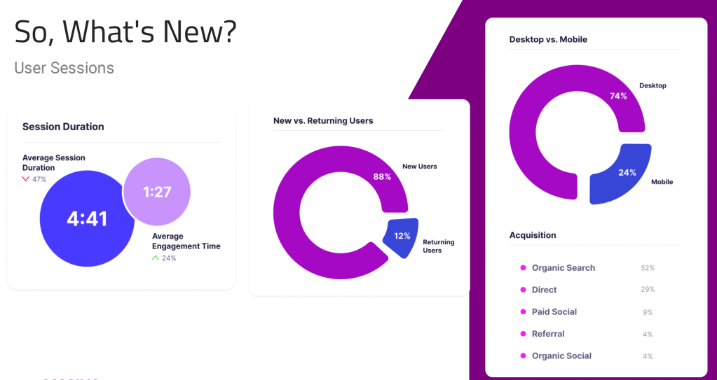
Using a combination of randomly selected and high-interest Hotjar user recordings, heatmaps, user click data, and Google Analytics data and journey mapping, I drew various conclusions regarding user behavior on the site.
Key UX/UI findings were revealed in this research and analysis phase:
Strengths
- Good engagement overall
- No glaring UX/UI issues
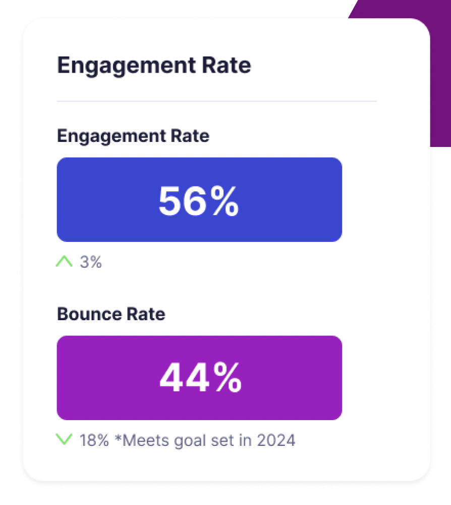
- Engagement rate above average for B2B website pages
- Lower engagement rate on blog posts
Areas for Improvement
- The most frequently visited page is Careers (19% of users)
- Goal to funnel users to other pages
- About, Connect, and Our Process
- Case studies section on the homepage is not serving the site, in fact, it may be harming it.
Side note: In the 2024 audit, I observed user behavior that indicated confusion with Inspira’s site menu. The client observed this recommendation and clarified menu titles and structure. Then, in the 2025 audit, no menu-related bounces or U-turns were observed, indicating that the implementation of this change was a success. With increases in engagement time and engagement rate, and decreases in bounce rate, it’s possible, but it can’t be said for certain that these menu changes positively impacted those metrics.

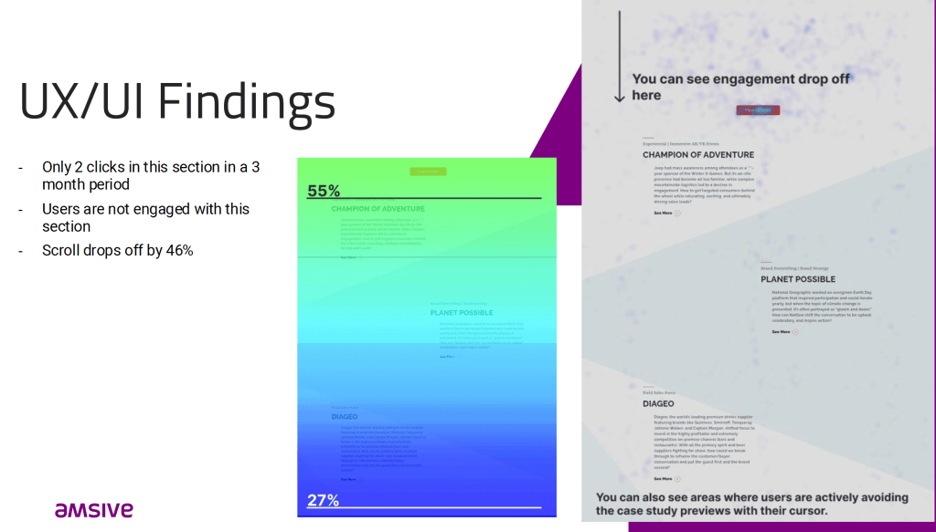
One of the most significant UX/UI findings that were consistent across both the 2024 and 2025 audits was that users were not engaging with the home page’s case studies section. Not only were users not engaging with this section, they were actively avoiding it with their cursor and dropping off the site entirely. As you can see in the screenshot below, the image on the right shows scroll depth; there is a drop off of 46% in this section, and you can also see users’ cursors actively avoiding the case study cards.
The Results
Simple Ripples for Big Waves
Recommendations
With clear findings and inferences derived from the data gathered, along with more expertise injected by the CRO team (conversion rate optimization), I made a handful of recommendations to the client.
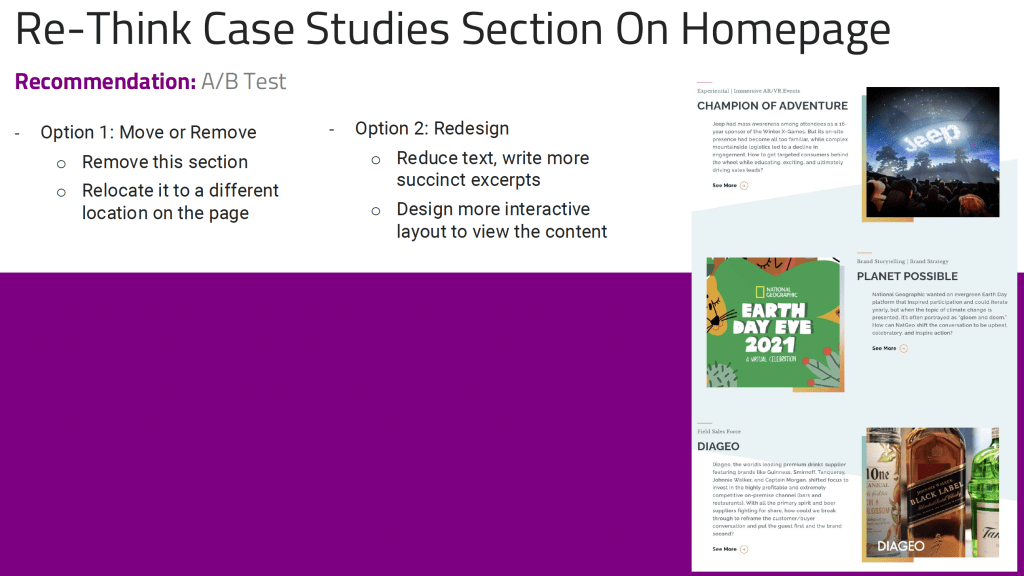

- I made mockups using screen captures of the current site for the client to visualize the recommendations
- I also made a placeholder awards block for the client to visualize

- Recommended and mocked up visible menu items instead of the current hamburger menu
Conclusion
The year-over-year audit displayed largely the same findings, indicating accuracy in audit research methods. The changes made from the 2024 audit (refining menu titles for clarity) resulted in fewer instances of user confusion when navigating via the menu, and could potentially be correlated with higher site engagement, longer engagement time, and reduced bounce rate. While the client did not ultimately implement the recommendations derived from the data-driven discoveries in these audits, the client is proceeding to undergo a full website redesign and rebrand with Amsive.


