The Challenge
Design a Product That Reflects Your Personality
The final project in my Typography class was to choose a product and design packaging for it in a way that reflected our personal style. As a student at CU Boulder, trying out all of the different craft beers Colorado has to offer, I decided to design a package for an IPA.
What I like about IPA packaging is that it is eye-catching and full of expression. The design usually consists of eccentric and fun colors and patterns, and when I’m choosing a beer to purchase, the packaging plays a large role in that decision process. It gives you a glimpse into what to expect. I thought this was a perfect choice for designing a product that reflects my own personality and style.
The Work
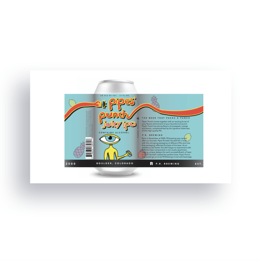
Pipes’ Punch: The Juicy IPA That Packs A Punch
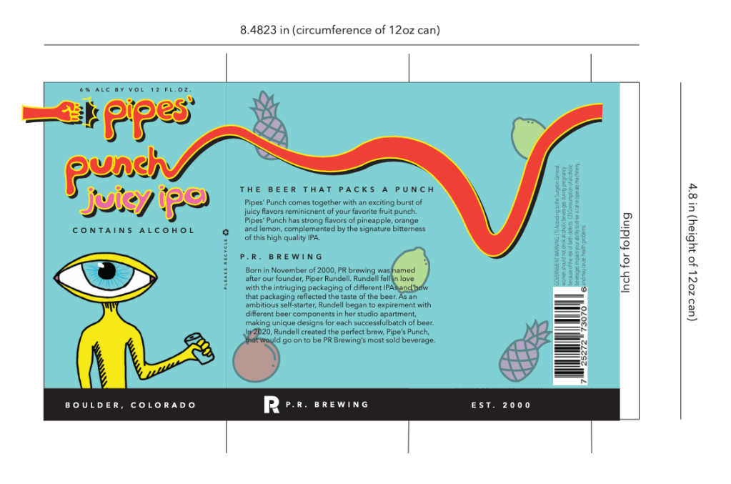
To guide the direction for the design, I created a mood board, which, in my opinion, can be one of the most fun steps in a design process. The mood board leans into fruity colors associated with punch, and set the mood for the design.

I then created a design guideline for the brand with the color palette, title design, content, and background, and a sort of “mascot” that would be featured on the product. The design came together with a playful and youthful association to punch, contrasted with a little bit of quirky edginess linked to IPAs and their enjoyers.

The Results
Playful Product Perfection