The Challenge
Design a Poster for the Colorado Symphony’s Concert Season
Provided with an extensive sheet of dates, descriptions, and details, I was tasked to create a poster doubling as a newsletter and calendar for the 2021-2022 Colorado Symphony events and concerts.
Designing for print, maintaining an elegant design for the Symphony, and also creating a useful resource for patrons became an exciting challenge as I began to test my skills in Adobe InDesign.
The Work
A Process of Color and Motion
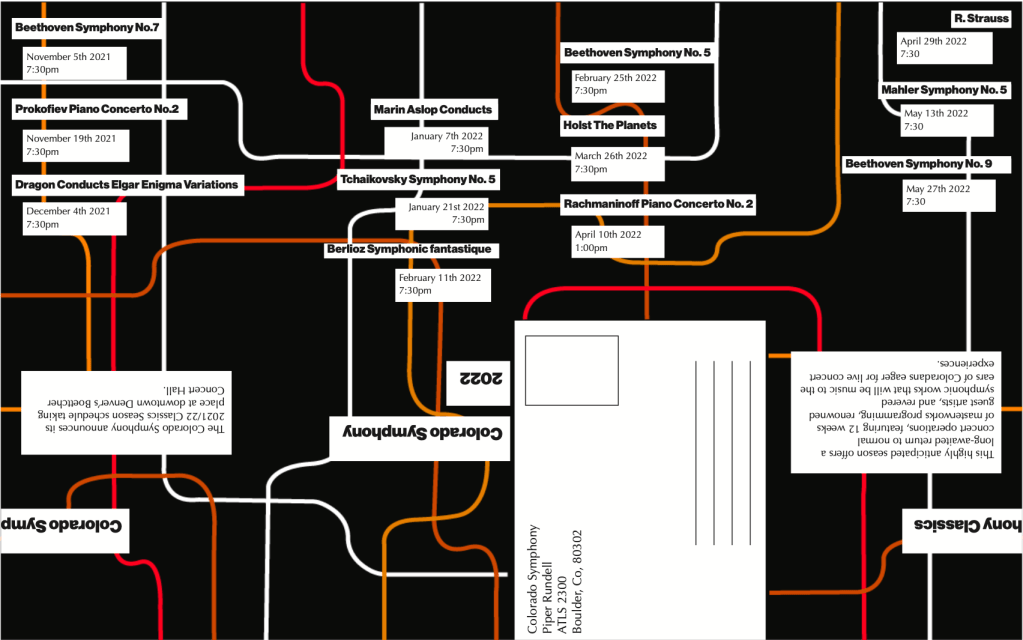
The design process began with sketches and brainstorming, as it so often does. This stage is where the seeds to the best ideas are planted, and we are able to pour more into them, watching them grow. I went forward with two designs, both centered around the movement and fluidity of classical music.
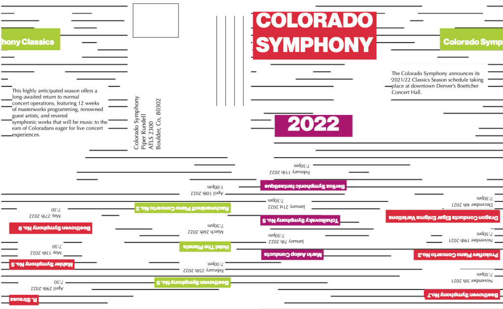
As you may be able to see, it was challenging fitting all of the text on poster-sized paper, as I was to fit an entire season’s worth of events on just one side of the page, while the other side would be the poster itself. Initially, my preferred design was the one on the left, but with the guidance of peers and instructors, the winning design became the lighter one, with the green, red, and magenta.


The Results
Designs that Sing
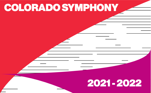
Using elegant sweeping shapes paired with carefully chosen colors, the final design was complete. The white with black lines symbolizes the lines and notes on sheet music, while the sweeping arcs pull inspiration from the iconic shells of the Sydney Opera House. They’re also a nice nod to the Denver International Airport tents that Coloradans know so well.

See the whole poster here:


